Tutorial & Collectible Locations
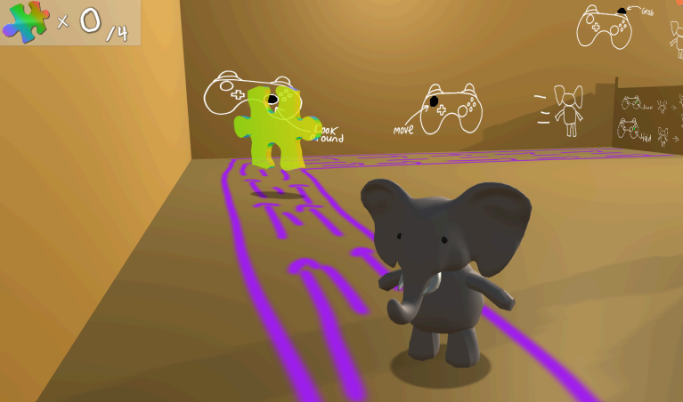
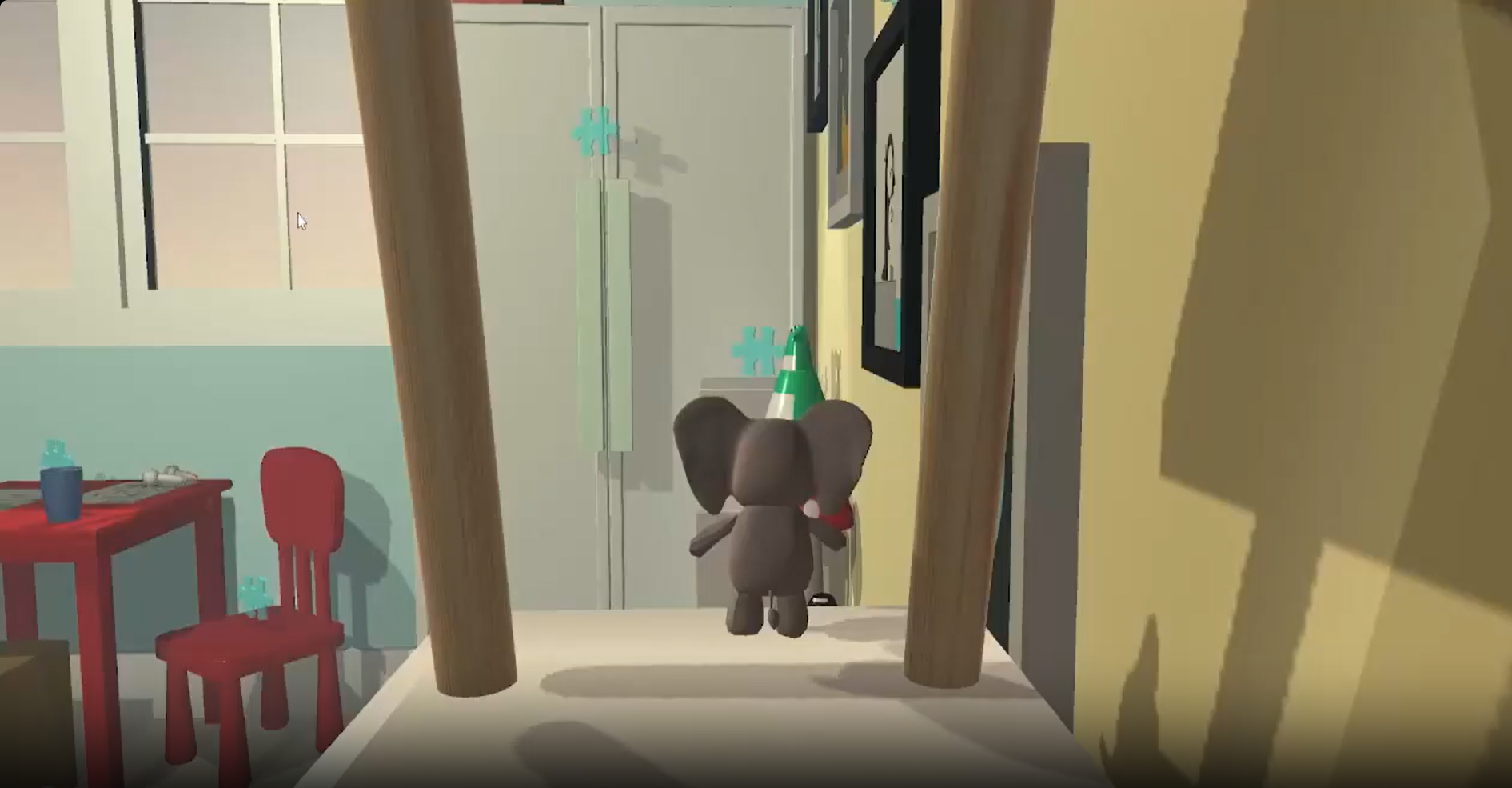
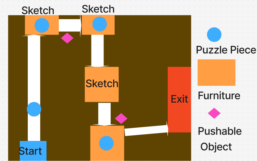
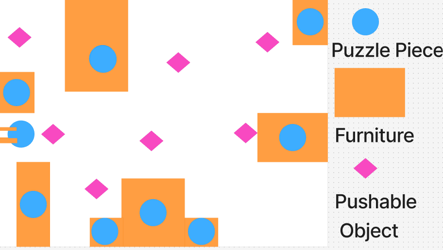
I designed the tutorial area for the game and how it onboards the player to the mechanics, using cute yet simple drawings to communicate the goals in a simple manner. I also placed the location of all the collectibles in the game, giving the user multiple ways to obtain each of them for flexibility and allowing the user to build their own path through the level.
What I Was Going For
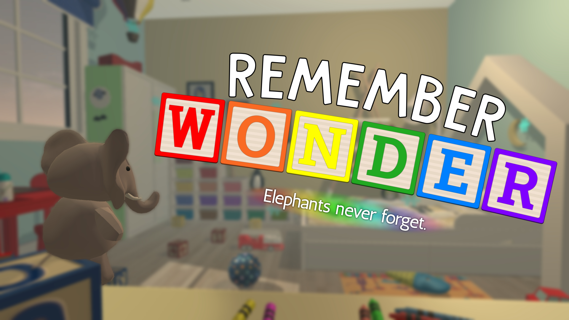
I wanted the level to maintain a cute aesthetic and maintain being completable by people of all ages, especially in the tutorial and the assets. When the game starts, the player is in a cardboard box, immediately placed in a childlike drawing directing them towards the instructions. Each area of the box has a similar drawing used to tell the player the mechanics they are working with, such as moving, jumping and altering the position of objects. It also introduces the player to the collectibles of the game, being puzzle pieces. After the player leaves the cardboard box, it appears extremely small on the outside, yet from the inside it is large. This creates a heightened sense of scale, as we want the player to feel like a small plushie bouncing around a sandbox-like space, creating their own solutions towards accomplishing the game's goals.
How It Evolved
Both the tutorial and the main sandbox went through significant redesigns over our one-semester timeline, shaped by bi-weekly playtests and the realities of scope.
Tutorial Area
Main Game / Sandbox
What Didn't Work
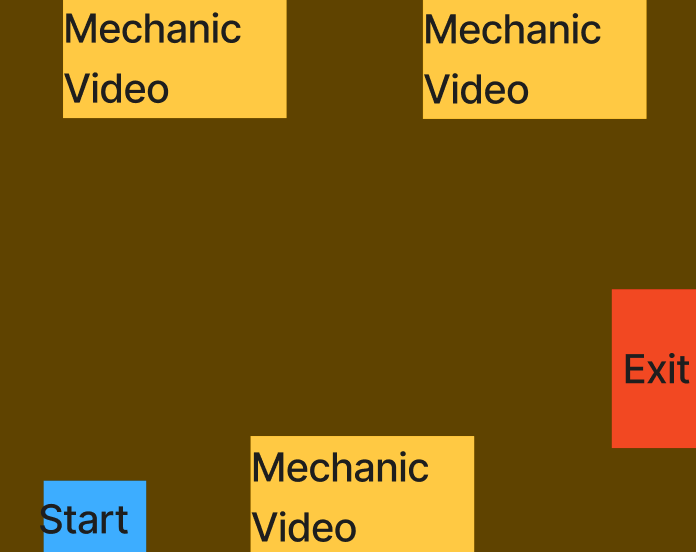
An important component of this project was introducing the player to the mechanics of the game, and we wanted to make sure the tutorial was strong at teaching the player what to do and how to play. The initial idea was to incorporate videos into the tutorial, as I wanted to incorporate technology into the onboarding; children used technology frequently at the time of development, so I was under the impression it would be a great method to teach the player everything they have to know. However, we realized the videos were not useful towards the learning process, as the player did nothing but stand by and watch them. This ruined the immersion of the tutorial, and we also eventually discovered children absorb information better by doing rather than listening or viewing. As a result, we modified the tutorial to the cute, childlike aesthetic drawings currently in the game, which really helped communicate the intent better and was more appealing to our target audience overall.
The Finished Space
The finished product is a single level starting with a tutorial explaining the mechanics through a cute aesthetic themed towards the youngest age of our target audience, followed by an interactive sandbox filled with toys set in a nursery. This game allows people to build their own path through the level, using the toys in any way they can to collect puzzle pieces.
What I'd Do Differently Now
If I could go back and redo this project, I would definitely be more careful about what young children would be able to accomplish in games if the difficulty is too much for them. In the design process, my team focused on making the game appeal for players of all ages with an emphasis on a minimum age of four. Even though we accomplished this in the aesthetic department, the core gameplay and level design are far too unapproachable for young children. Despite having no way to technically "fail" the game, a lot of the collectibles require tight jumps and precision. In our testing, we saw a lot of people not experienced with gaming struggle completing it. Several collectibles were placed in extremely arbitrary areas, requiring a high level of skill to reach successfully. I would make sure the game is more akin to the tutorial, slowly yet steadily expanding on the mechanics instead of giving the player total freedom when they may not have grasped the mechanics themselves.